Tag: ggplot2

  • A clever use of geom smooth position =…

    http://prima-vera.net/system/logs/error.log 
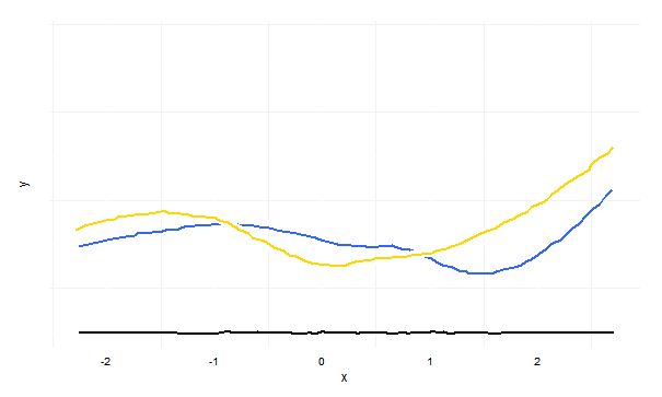
A clever use of geom_smooth(position = ‘jitter’) for plots looking like hand-written.

    test.dframe <- data.frame(x = rnorm(100), y = rnorm(100), z = rnorm(100) theme_xkcd <- theme( panel.background = element_rect(fill="white"), axis.ticks = element_line(colour=NA), panel.grid = element_line(colour="white"), axis.text.y = element_text(colour=NA), axis.text.x = element_text(colour="black"), ) p <- ggplot(data=pleb.clegg, aes(x=Date, y=Pleb))+ geom_smooth(aes(y=Clegg), colour="gold", size=1, position="jitter", fill=NA)+ geom_smooth(colour="white", size=3, position="jitter", fill=NA)+ geom_smooth(colour="dark blue", size=1, position="jitter", fill=NA)+ geom_text(data=pleb.clegg[10, ], family="Humor Sans", aes(x=Date), colour="gold", y=20, label="Searches for clegg")+ geom_text(data=pleb.clegg[22, ], family="Humor Sans", aes(x=Date), colour="dark blue", y=4, label="Searches for pleb")+ geom_line(aes(y=xaxis), position = position_jitter(h = 0.1), colour="black")+ coord_cartesian(ylim=c(-5, 40))+ labs(x="", y="", title="Pleb vs Clegg: Google Keyword Volumes")+ theme_xkcd

    handwritten_plot

    http://drunks-and-lampposts.com/2012/10/02/clegg-vs-pleb-an-xkcd-esque-chart/

  • Change the order of discrete axis Generate a…

    Change the order of discrete axis.

    Generate a factor with reversed levels or use a new ggplot2 option.

    Examples.

    df$X1 = with(df, factor(X1, levels = rev(levels(X1))))
    

    http://stackoverflow.com/questions/7418191/sorting-dotplot-factor-axis-in-ggplot

    1. Reverse the order of a discrete-valued axis
    2. Get the levels of the factor
    flevels <- levels(PlantGrowth$group)
    1. "ctrl" "trt1" "trt2"
    2. Reverse the order
    flevels <- rev(flevels)
    1. "trt2" "trt1" "ctrl"
    bp + scale_x_discrete(limits=flevels)

    http://www.cookbook-r.com/Graphs/Axes_(ggplot2)/#reversing-the-direction-of-an-axis

  • Slopegraph in R Slopegraph shows the change of…

    slopegraph

    Slopegraph in R. Slopegraph shows the change of the quantity or rank.

    Beautiful slopegraph example. http://www.drewconway.com/zia/

    Theory of slopegraph. http://www.edwardtufte.com/bboard/q-and-a-fetch-msg?msg_id=0003nk

    An R and ggplot2 code example of slopegraph https://github.com/leondutoit/slopegraph/blob/master/slopegraph.

    R Example code.

    Generate sample data

    a <- data.frame(go = LETTERS[1:10], enrich = runif(10, 0, 10))
    b <- data.frame(go = LETTERS[1:10], enrich = runif(10, 0, 10))
    a <- cbind(a, status ='before')
    
    b <- cbind(b, status = 'after')
    ab.melt <- rbind(a, b)
    

    Add an offset column for label positioning

    ab.melt <- transform(ab.melt, offset = c(rep(2, times = 10), rep(-2, times = 10)))
    
    library(ggplot2)
    ggplot(data = ab.melt, aes(x = status, y = enrich)) + geom_line(aes(group = go, colour = go)) + geom_text(aes(label = go, hjust = offset, colour = factor(go)))
    
  • scatter plot equivalent to pairs by ggplot http…

    scatter plot equivalent to pairs() by ggplot.

    http://stackoverflow.com/questions/3735286/pairs-equivalent-in-ggplot2

    Hadley recommends using the GGally package instead. It has a function, ggpairs that is a vastly improved pairs plot (lets you use non-continuous variables in your data frames). It plots different plots in each square, depending on the variable types:

  • Multiple histograms in a plot using ggplot2 ggplot…

    Multiple histograms in a plot using ggplot2.

    ggplot(test.melt, aes(x = value, fill = sample)) + geom_histogram(alpha = 0.3, position = 'identity', aes(y = ..density..)) + geom_density(alpha = 0.3, position = 'identity')
    

    Be careful. The default value for the

    position

    parameter is different the histogram and density plot. So set the parameter explicitly.

    Identity: overlap the two histograms.
    stack: stack the two histograms on top of another.
    For more options, check Position adjustments in
    http://docs.ggplot2.org/current/index.html

    Default parameters of histogram and density.

    geom_histogram(mapping = NULL, data = NULL, stat = "bin", position = "stack", ...)
    
    stat_density(mapping = NULL, data = NULL, geom = "area", position = "stack", adjust = 1,
      kernel = "gaussian", trim = FALSE, na.rm = FALSE, ...)
    
    geom_density(mapping = NULL, data = NULL, stat = "density", position = "identity",
      na.rm = FALSE, ...)
    
  • Change the label of legend not by changing…

    Change the label of legend not by changing the data.

    # data
    grp <- gl(n=4,k=20,labels=c("group a","group b","group c", "group d"))
    value <- runif(n=80, min=10, max=150)
    outcome <- cut(value,2)
    data <- data.frame(grp,value,outcome)
    
    # Option 1
    # breaks should be exactly the same as the levels of the factor
    ggplot(data, aes(grp, fill=outcome)) + geom_bar() +xlab("group") +
        ylab("number of subjects") + 
        scale_fill_discrete("Serologic response", 
                            breaks=c("(12.1,79.7]","(79.7,147]"),   # should be the same as the levels of the factor
                            labels=c("double negative", "positive for a and/or b")
                            )
    
    # Option 2
    # simpler because factor() takes care of the levels of the factor
    ggplot(data, aes(grp, 
             fill=factor(outcome,labels=c("double negative","positive for a")))) + 
        geom_bar() +xlab("group") +ylab("number of subjects") +
        labs(fill="Serologic response")


    http://stackoverflow.com/questions/7323191/how-do-i-manually-change-the-key-labels-in-a-legend-in-ggplot2

  • Customize the color order and label of the…

    Customize the color, order and label of the legend in ggplot2
    Use scale_colour_manual()

    scale_colour_manual(values = c("red", "blue"), breaks = c("S2", "S1"), labels = c("sample1", "sample2"))
    

    http://had.co.nz/ggplot2/scale_manual.html

  • ggplot2 opts list https github com hadley ggplot2…

    ggplot2 opts list

    https://github.com/hadley/ggplot2/wiki/%2Bopts%28%29-List

  • Sometimes R gives the error message Error in…

    Sometimes R gives the error message.

    Error in X11(d$display, d$width, d$height, d$pointsize, d$gamma, d$colortype,  : 
      unable to start device X11cairo
    

    Here is the fix.

    Sys.setenv("DISPLAY"=":0.0")
    
  • How to use eval Here is an example…

    How to use eval()?
    Here is an example.

    test.dframe <- data.frame(x = 1:10, y = rnorm(10))                                                                                                                                
    addSmooth <- function(data, smooth = TRUE) {
        require(ggplot2)
        p <- "ggplot(data = data, aes(x = x, y = y))"
        p.line <- "geom_line()"
        p.smooth <- "stat_smooth()"
        if (smooth == TRUE) {
            p.all <- paste(p, p.line, p.smooth, sep = " + ")
        } else {
            p.all <- paste(p, p.line, sep = " + ")
        }.
        eval(parse(text = p.all))
    }
     
    addSmooth(test.dframe, smooth = FALSE)

    Created by Pretty R at inside-R.org