Plot multi column data with ggplot
ggplot is a great visualization tool for R. It draws beautiful plots but the difference from the native plotting system in R takes some time to get used to it.
Here are two examples how to plot data in multiple columns.
The original data have three columns with one x-variable and two y-variables. The data look like this.
head(e.plot$nucl.di.sm)
     x       aatt       ggcc
1  -71 0.10117730 0.05899822
2  -70 0.09955112 0.05715069
3  -69 0.09949577 0.05404929
4  -68 0.09990107 0.05115649
5  -67 0.09933432 0.04910463
6  -66 0.09688013 0.04802868
7  -65 0.09345548 0.04829135
8  -64 0.09024192 0.04977192
9  -63 0.08826623 0.05155951
10 -62 0.08823234 0.05227631
First, I can use separate geom for each column.
e.plot$dinucl.plot <- ggplot(e.plot$nucl.di.sm)

e.plot$dinucl.plot + geom_line(aes(x = sidx.plot.x, y = aatt, colour = 'AATT'))
  + geom_line(aes(x = sidx.plot.x, y = ggcc, colour = 'GGCC'))
+ scale_colour_discrete("Pattern")
 + xlab("Dist from dyad") + ylab("Dinucleotide frequency")
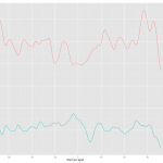
This was the first approach and the result is below.

Plotting was easy but I had to spend quite a bit of time to figure out how to change the color and put the legend. Check Hadley's answer for this. How to change the legend title
Then I found there is another way of doing it. It involves reshaping the data using melt() came with reshape package.
e.plot$test.melt <- melt(e.plot$nucl.di.sm, measure.vars=c('aatt', 'ggcc'))
After reshaping by melt, the data look like this.
head(e.plot$test.melt)
     x variable      value
1  -71     aatt 0.10117730
2  -70     aatt 0.09955112
3  -69     aatt 0.09949577
4  -68     aatt 0.09990107
5  -67     aatt 0.09933432
6  -66     aatt 0.09688013
7  -65     aatt 0.09345548
8  -64     aatt 0.09024192
9  -63     aatt 0.08826623
10 -62     aatt 0.08823234
Then the data can be plotted with one geom.
e.plot$test.melt.ggplot <- ggplot(e.plot$test.melt)

e.plot$test.melt.ggplot + geom_line(aes(colour = variable))
+ scale_colour_discrete("Pattern")
+ xlab("Dist from dyad")
 + ylab("Dinucleotide frequency")
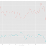
With this method, ggplot took care of colors and legend automatically. Cool! Here is the result.
As you can see the two results are almost identical except for the label in the legend. The label follows the column name of the data. I have a feeling, also from several comment online, that ggplot prefers long table to wide table or one column for y variable. If you want this approach, melt will be a invaluable tool and ggplot takes care of many formatting jobs so that user can save lots of time.
http://stackoverflow.com/questions/1787578/problem-with-legend-while-plotting-data-from-two-data-frame
http://stackoverflow.com/questions/1313954/plotting-two-vectors-of-data-on-a-ggplot2-scatter-plot-using-r
Update: I found a way to change the labels for the legend.
e.plot$test.melt.ggplot <- ggplot(e.plot$test.melt)
e.plot$test.melt.ggplot + geom_line(aes(colour = factor(variable, labels = c("AATT", "GGCC"))))
+ scale_colour_discrete("Pattern")
+ xlab("Dist from dyad")
+ ylab("Dinucleotide frequency")
http://stackoverflow.com/questions/2339953/how-to-add-custom-series-labels-to-a-legend-in-rs-ggplot

Leave a Reply
You must be logged in to post a comment.